Thursday 31 October 2013

Character Development

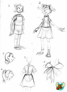
So with a little word during a tutorial we realized we've got our priorities in the wrong order. Top of the agenda should be the character design. So with Meg's rather helpful influence map and inspiration from our art style between us we have produced the sketches below.


Her are some of Meg's thumbnail sketches including the deliberation as to how tall our character should be. We feel drawn to the design thats four and a half heads high. The girl looks old enough to understand some of the situation around her. The fear behind the Atomic age, but young enough to still have an air of naivety in the way she plays with her toys.


While Meg went about the thumbnails the traditional way I hopped to it with a graphics tablet drawing on the cartoons of the era. Beginning with faces and head shapes and slight variations in hairstyles before I moved on to bodies.

Heads

Bodies


Wednesday 30 October 2013

Animatic Development.

In preparation for the pitch I got to working on the animatic for our story, developing the scenes visuals from the script and implementing a little artistic license where the script was vague. I discovered however there was a rather large hole in our script on the key scene. That being the third act. Trying to express the space as a bunker without quite literally sticking a sign to the wall proved to be quite difficult and for the purposes of finishing the animatic I simply implemented a corrugated ceiling and the presence of a fifties radio which wasn't really enough. The animatic below is the silent first version.


After a talk with Alan and with our third scene being flagged as 'not-quite-right-yet' Alan suggested that we needed more paraphernalia belonging to the family scattered about the bunker. Maybe self help guides or magazines, instruction leaflets and the like.The cans of food and jugs of water, crates of things and items such as gas masks and blankets will help to hammer home the situation. Also to try and communicate this better a change in the camera angles used in that scene would really aid our animation.

I decided to do a little more research into bunker interiors and found the very helpful videos linked here. The video's show an interview and exploration of an almost untouched 1950's bunker in Michigan USA, Complete with survival kits. This video really gave a sense as the the size of the space and how everything worked.

Now we are going to reassemble another animatic this time with incorporated sound design.

Chosen Art Style

Meant to blog this a while ago but it dropped in the list of priorities. Here is the fifties cartoon style we have in mind for our world which will hopefully appear in the thumbnails as they are completed. Alll the images are scans taken from a book called the 'Cartoon Modern- Style and Design in fifties Animation'- written by Amid Amidi.


Its a wonderful style, simple, angular and fun. Evoking the slapstick humour of Looney Tunes and Merry Melodies, also the Flintstones. The look combining block shapes and colour with a smattering of texture.


The image below is our hero image. The second we spotted it we knew this was the style we wanted for the world of 'dolls in the dark'. There is a mass of potential to twist the reality visually so that the fantasy world of the little girl looks quite skewed. But also we can use colour palettes to differentiate between reality and fantasy. The below feels like the more subdued tones of our main characters reality.


Reworked Storyboard

Here we have our storyboard. However this version is devoid of the art style that we have in mind. It was purely so we could work out the camera ad action taking place within our story. The animatic will help better explain the motions within our story and eventually Pre-viz will leave no question as to the points of view and camera actions we would like!


The mish-mash of scenes and points of view towards the end are a series of close ups in mind that show the bunker to be just that, a bunker. They will be a collection of drawn out zoom's and Ken-Burns shots before finally the little protagonist is focused upon... alone awaiting the dark.

Sunday 20 October 2013

Illustrator Work


After talking to Alan about 1950s animation backgrounds, a style which apparently is called 'Shaggy', I tried replicating it in Illustrator. I'm not entirely thrilled by it, Illustrator is a tricky program to wrangle so I cut quite a few corners. Looking at it shrunk down I see that my intention of making sure no two lines were perfectly parallel may have gone a little overboard. Oh well, live and learn!

Saturday 19 October 2013

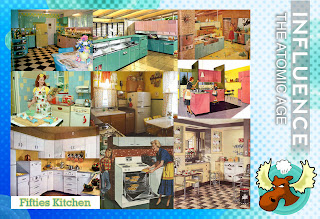
Influence Maps-The Lounge, the Kitchen and the Dolls

In the grand scheme of things the interior decorating of the fantasy world invented by our main character, the little girl will be completely stereotypical fifties. The colour schemes and the decor not too dissimilar from the items featured in our influence maps.


However the Dolls have proved more difficult. In conversation with Alan we voiced our confusion on how these dolls should move in the first two acts of our narrative. Should we make obvious joints on them, if so how many, should they be realistic to dolls of the time? his suggestion is that we take something simple such as Playmobil dolls (second row, first image) and give them more human anatomy. I feel this is a good place to start, but I am also attracted to the simplistic nature of the Flagg Dolls (Third row, far right). These are dolls that were available during 1950's, they have some limited movement...


Monday 14 October 2013

Bunker - Initial Thumbnails


At this point I'm still quibbling back and forth regarding a private or public bunker. #4 and #5 were largely to establish the bare necessities for survival, and figuring out how to best use the limited space of a bunker. I'm not sure it's the very best use, as I foresee a lot of falling-over of chairs. What I gathered from these thumbnails is how there can be absolutely no wasted space in a bunker, so as well as feeling claustrophobic due to the low ceiling and windowless walls, it will also need to feel crowded by furnishings.

Dolls in the Dark Initial Bunker Resources

I've taken on the duty of designing the bunker interior for the animation; I'm planning to render it in a more realistic, 'gritty' style than that of the little girl's reverie to drive home the seriousness of the situation. So, obviously, I'm going to need some references, particularly as the closest I've ever been to 'subterranean' is the CGAA base room.

I've put together a major 'cheat sheet' for my own reference, but the file is huge - open at your own risk.

So, for your viewing pleasure, here's a slightly more geriatric-laptop-friendly version.

Bunkers are fun. I have fond  memories of playing in old block houses out in the marshes near my house, back when I actually went outside and ran about. World War and Cold War architecture has always been close by for me.

Basements and the like, not so much. The soil in my village has a hard enough time tolerating the foundations of above-ground buildings, so underground architecture is more-or-less out of the question. What I love about cellars is the sheer variety, from wine cellars to root cellars to data centres to places-where-people-put-their-stuff-to-forget-about-it. I'm not sure whether we want to go down the private shelter route or whether we want the shelter to be huge, as though it was a public building, so I'm keeping my options open.

Last but not least, there's this very informative bunker study by Michael Janzen. The accompanying article is excellent as well. It discusses the basic principles of nuclear-survival architecture, such as the importance of 90-degree turns in ventilation systems to keep irradiated particles from entering the bunker, and various building materials and the amount of them needed to block radiation.

Idea 4- Dolls in the Dark


Previously Meg and I here at Grumpy Moose had decided to try and run with the following idea for our Atomic era inspired animation.

'A day in the life of a dolly housewife. The husband is waved off to work with his lunch. The daughter helps out cleaning the house and making apple pie. The dolls world flickers away to reveal the reality. A little girl sits utterly alone in a bomb shelter playing with the dolls. Over the sounds of a radio playing music, the room shakes with what sounds like a bomb impacting.'

In our brainstorming session over the idea and how it would work I drew up a storyboard, which in the space of a few hours completely evolved again. However all the same we wanted to record its progress. In the images below, the main figure is the housewife doll until reality is exposed and the dolls world is seen to be the little girls fantasy.


The storyboard changed as we realised this was the fantasy of a young girl who is now very alone in a bunker. And her fantasy would be as biased to her dreams as possible. Therefore it would make it more likely that the 'daughter' dolly character would be another version of herself. And like any small child would love to spend time with her mother, learning how to be a good housewife for her future husband.   So with this in mind we devised a script, building on this newly evolved idea.

Sunday 13 October 2013

The New Idea's- The 3 Act Structure

As was mentioned in the previous post. A three act structure was the new aim of the game and below are a series of ideas revolving around the Atomic Age.


1. A fifties housewife straightens up the perfect suburban home. Playing super-mum, gourmet chef and welcoming home home the husband with a peck on the cheek. As the door closes however you realise its a vaulted door and then come to realise 'home' is a bomb shelter buried below ground.


2. A pair of children pretend to be news reporters, sitting behind fold out tables and reporting on the mundane and mildly amusing, making fun until their mum appears with their food on trays. They settle to watch a real news broadcast consisting of an atomic bombing and shattering their playtime.

3. A giant dinosaur attacks a pretty suburban town- In reality its the clashing of a brother and sister at playtime. The young boy crashes about playing Godzilla, disturbing his sisters perfect village. He goes to trample one of the dollhouses when the toys topple before he can reach them. Looking to the window, all that can be seen is a mushroom cloud rising in the distance.


4. A day in the life of a puppet housewife as she goes about her daily business. The husband is waved off to work with his lunch. The daughter helps out cleaning the house and making apple pie. The puppet world flickers away to reveal a little girl playing with dolls. She sits alone in a bomb shelter as the light bulb flickers and the room shakes with the impact of a bomb.


After discussion with Meg we found ourselves leaning more towards idea 4. Having such a massive contrast between the fakery and plasticised lifestyle of the puppet/ doll's apple-pie lifestyle and the grim reality of the girl playing with those dolls, hiding out in a bunker as a sole survivor, really covers the duality of the fifties. the optimism in the face of the dark reality that man could now destroy itself.

Round we go again- New influences for new ideas!

So another conversation with Phil and ideas have bee rejigged once again. The car idea just had no Story content, no feeling to it what so ever. So Phil took me back to basics. Start off with a three Act Structure and two inspiring video's that incorporate this are these two. 'Kiwi!' and StoryCorps 'She Was the One'


Both video's story structure resonate well with the theme of duality. A theme which is also present during the atomic age The fifties was a time of optimism and fear. Man was getting back on its feet following the world wars, but finding new ways to destroy itself simultaneously with Atomic weapons. So while the Kiwi makes its first flight, we suddenly realise how it ends tragically as the Kiwi falls to its doom. As for the Storycorp episode, the voice over provides a similar three act structure, the interview sets the scene of life before 9/11 to the events as they unfolded and finally the conclusion.

This three act structure- where the audience simply absorb the happenings of the first two acts before getting clonked over the head with a twist- is a sequence that just works. It was a structure Meg and I had tried before with the early storyboarded idea of the airliner turning out to be a bomber carrying the H-Bomb. But now with the concept of three acts revitalised I went about coming up with some new ideas...


The Fifties Failed Car- the Ford Edsel

Here is the initial script for our crazy Fifties car idea, detailing a crash test dummy's endurance of 'progress'


Having completed our first scripted effort and with a little more direction from both Phil and Alan, we were instructed to look at different types of cars. Maybe some of the worst models, to pick up on their failures and add them to the disastrous mix for our escalation animation idea. The failure car was the Ford Edsel.


Due to the strange complications between car manufacturers it would appear many of this model car reached the end of the production line unfinished and were even sent to dealerships missing parts. When it came down to popularity, a hype had been built up through various advertising methods, culminating in general disappointment and indifference towards the car when it was finally revealed to the public. As for physical faults or goofs there were not very many. Apparently the hood ornament had a tendency to fly off when the car reached 70mph and buttons on the steering wheel to change gears was a cumbersome edition to the car. In any case people tend to remember this car as an absolute failure and as a creative studio, Meg and I thought we could use that...

However throughout or scheming we were losing sight of the Atomic age and Phil quite rightly pointed out we should be incorporating the atom into our car. Make it nuclear powered. The fifties was a time when nuclear energy was considered a great thing, the future and progress. Plus there was potentially more material to work with. For example the car would glow in the dark due to the radiation...


There is plenty to be getting on with and time to flesh out a new script....

Friday 11 October 2013

The Car of the Future! - Another idea...

So we went into a tutorial with not much. A few ideas that we didn't really have our heart and soul in and walked away with a new idea courtesy of Alan.

If there is one commodity that shows its age, it is the car. Cars from every era have their traits linking them to their time period. The fifties was a time of optimism and looking towards the stars and new technologies. Combining a car and new gadgets could easily become an animation of escalation as gadgets fail in spectacular fashion and such like.

With this idea in mind and also old cartoons such as 'Wacky Races' and then being inspired by a series of links given to us by Alan about 'Cars of the future' Meg and I engineered a new idea.

Wacky Races


'A crash test dummy could suffer horrifically at the tests on a new space age car. Eventually the recent invention of the seat belt can save him from the mishaps of the malevolent car.'

The idea was that this car could have jets for acceleration, wings for flight, Ejector seats possibly and even legs for covering all terrain. With each of these features would be another way for the crash test dummy to come to a nasty end. With high speed acceleration comes a high speed stop. Therefore a crash test dummy could easily fly through the windscreen. Flying in an open topped car when you're not strapped in won't end well and ejector seats... there is definite comedy value to be had.


So what else went on in the fifties...?- other idea's

Having done a fairly narrow search field into the atomic age I set about looking at what else happened during the fifties aside from the bomb tests and conflicts. There was a fair amount that went on, from the completely mundane to some fairly groundbreaking...
For example the discovery of DNA, NASA was formed, Disneyland opened, Peanuts comic strips were first published, Colour television was invented. Russia launched the first spacecraft Sputnik and later launched the first living creature (a dog named Laika) into space.


 This lists just a  few of many things to take pace during the fifties. I feel that this rather generic search may help us find an idea. Or possibly provide some features to give a little wow factor to our eventual idea.

For example, lego building bricks invented during that period could provide an interesting style when creating an animation.
Television is a clear indicator of era and so perhaps using a colour television, or creating an advertisement would be apt for the period.
Creature features and the like were popular during the fifties, so creating a sic-fi horror of our own , or something based on the 1950's novel 'Day of the Triffids' could be viable...


Monday 7 October 2013

Duck and Cover!- Idea 2

In the early fifties, Soviet Russia began to test nuclear weapons. In response, the US governments Civil Defence branch created awareness videos to try to prepare the American public for the event of a Nuclear bombing.
In the example below there is a harmless innocence due to the cartoon nature of 'Bert the Turtle'. And despite having live-action elements, describing what to do in the event, the actions taken are carried out unbelievably calmly and seem all but useless against a bomb blast! The terrifying fact was that America could quite literally have been levelled at any second by a nuclear attack and keeping morale up with a can-do attitude was necessary. However the whole thing has an element of sticking a plaster over a gaping wound.


Meg and I wondered if we could play on the ridiculous nature of some of these duck and cover techniques. Create perhaps a dark comedy. Or possibly use a little of the Loony Tunes and Merrie Melodies style to lighten things to a Wile.E.Coyote and Roadrunner level. The cartoons were well and truly established by the fifties.


However, again, this idea lacks any real story and so the idea was also scrapped.

Thoughts Behind the Initial Idea

We began everything with a brainstorming session culminating in a filling of a couple of notebook pages. The first page being the various ideas that came from the tops of our heads, the second page is where we tried to narrow things down and make sure contact was no issue.The third was the point in which we began to ponder our studio identity! Here is the seedling that grew into our beloved Grumpy Moose!


As can be seen from the notes, our general idea was that the 'atomic era' was chock full of conflict and were generally dark times. We went onto do a little research into the subjects we plucked from the backs of our minds, disregarding anything out of our time frame and noting any interesting stories we discovered along the way.

We also investigated a couple of the art styles around at the time particularly poster artworks and propaganda.


It was this research and the poster artwork that led to the first idea we'd had. The aircraft over some tropical islands eventually flying over Bikini Atoll to drop the nuclear weapon. However as Meg quite rightly said the idea was scrapped for the lack of storytelling.


Sunday 6 October 2013

Initial Idea

Our first solid idea (after many, many nonfunctional ones) was to look at the dichotomy inherent in the Cold War era - the dichotomy of hope and fear, of grand opportunities and ever-looming danger. With the success of the Manhattan Project, the world was looking at a new age of prosperity ushered in by nuclear power. The USA in particular was already booming from the Second World War, and the overall standard of living there was on the rise. This was evidenced in the ever-increasing amount of travel, including international travel by aeroplane. It was this that caught our interest, and we wanted to look at the slight irony of how wartime advances in aeronautics had benefitted civilian life, and the dark purpose those vehicles still carried out even after the war was over.

Initial Unscripted Storyboard (Note: Reads top-to-bottom, left-to-right)

The intention (which is a little hard to read, especially as I never got around to finishing this) was to depict a plane passing over a tropical island, and all the opulent holidaymakers that entails. It would then pass towards a series of coral islands, and the camera would 'detach' from the plane to reveal that it was a B-29 Supercarrier bomber, dropping the first atomic bomb on Bikini Atoll.

We scrapped this idea as it was lacking in any actual story content, and its commentary wasn't entirely clear.

Friday 4 October 2013

Welcome to Grumpy Moose Productions!

A hearty welcome to the blog!

This here will be the creative space in which my accomplice Meg Leslie and I (Emily Clarkson) will post our research and development, trials and tribulations, creations and failures in order to create a short animation.

This project involves other studios also creating similar short animations. Each however has been assigned a different period in history. Once the project is complete, the series will be assembled to create a portmanteau film (a collection in short)

We have been assigned the Atomic Era- 1945-1960


Onwards to the research!!!


Tuesday 1 October 2013

TEST POST PLEASE IGNORE

Lorem ipsum dolor sit amet, consectetuer adipiscing elit, sed diam nonummy nibh euismod tincidunt ut laoreet dolore magna aliquam erat volutpat. Ut wisi enim ad minim veniam, quis nostrud exerci tation ullamcorper suscipit lobortis nisl ut aliquip ex ea commodo consequat. Duis autem vel eum iriure dolor in hendrerit in vulputate velit esse molestie consequat, vel illum dolore eu feugiat nulla facilisis at vero eros et accumsan et iusto odio dignissim qui blandit praesent luptatum zzril delenit augue duis dolore te feugait nulla facilisi. Nam liber tempor cum soluta nobis eleifend option congue nihil imperdiet doming id quod mazim placerat facer possim assum. Typi non habent claritatem insitam; est usus legentis in iis qui facit eorum claritatem. Investigationes demonstraverunt lectores legere me lius quod ii legunt saepius. Claritas est etiam processus dynamicus, qui sequitur mutationem consuetudium lectorum. Mirum est notare quam littera gothica, quam nunc putamus parum claram, anteposuerit litterarum formas humanitatis per seacula quarta decima et quinta decima. Eodem modo typi, qui nunc nobis videntur parum clari, fiant sollemnes in futurum.