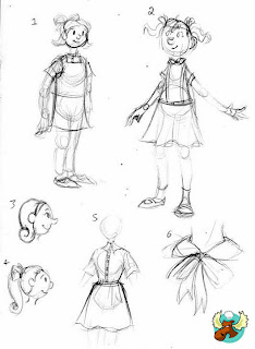
Her are some of Meg's thumbnail sketches including the deliberation as to how tall our character should be. We feel drawn to the design thats four and a half heads high. The girl looks old enough to understand some of the situation around her. The fear behind the Atomic age, but young enough to still have an air of naivety in the way she plays with her toys.
While Meg went about the thumbnails the traditional way I hopped to it with a graphics tablet drawing on the cartoons of the era. Beginning with faces and head shapes and slight variations in hairstyles before I moved on to bodies.
Heads
Bodies


No comments:
Post a Comment